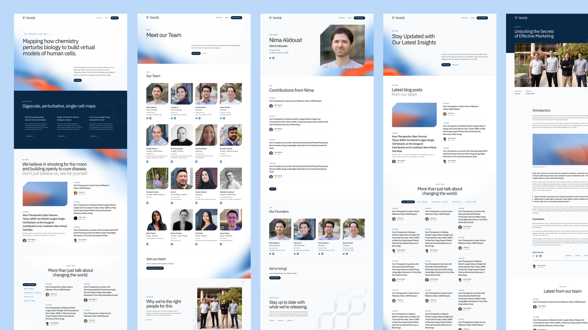
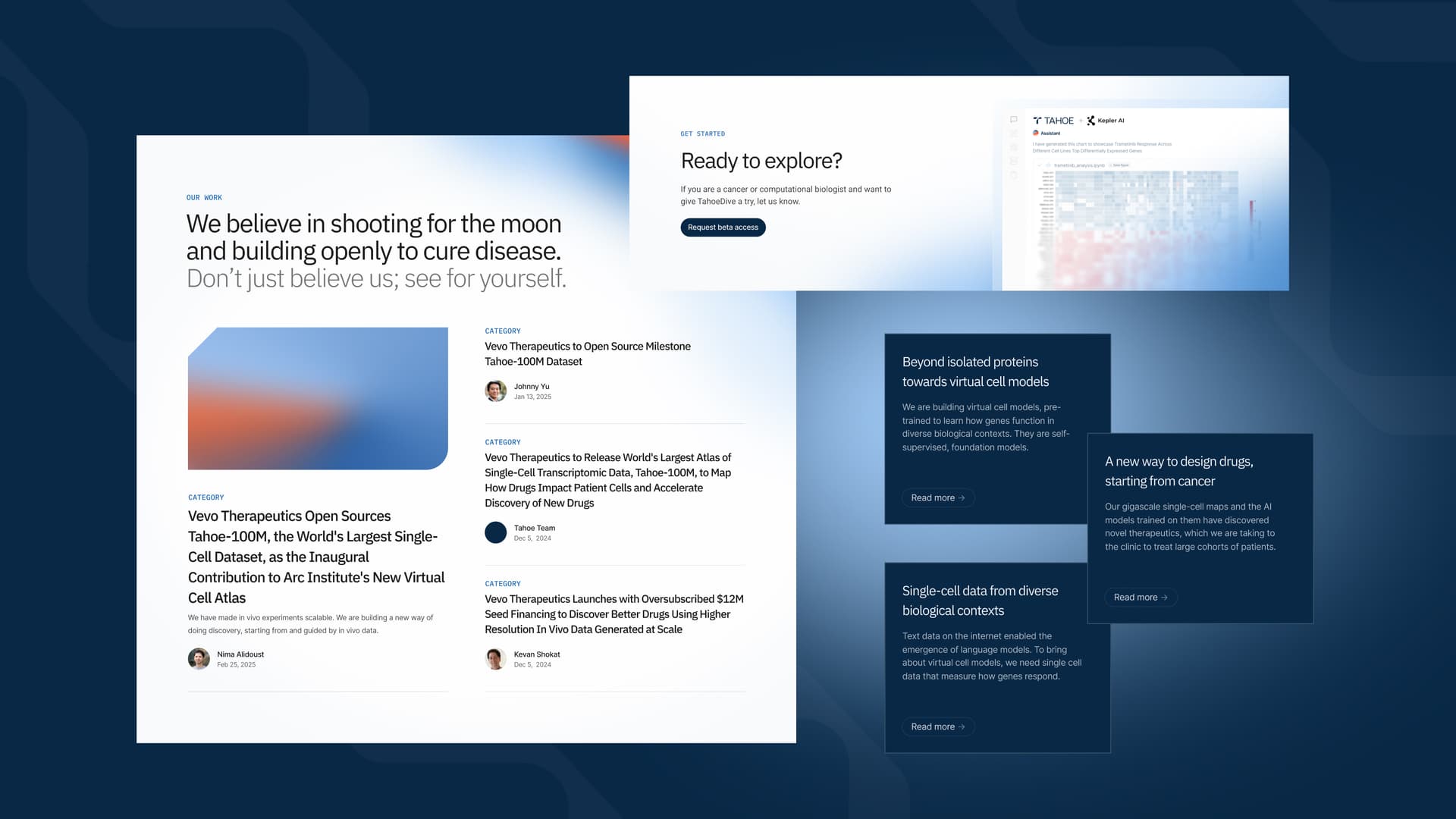
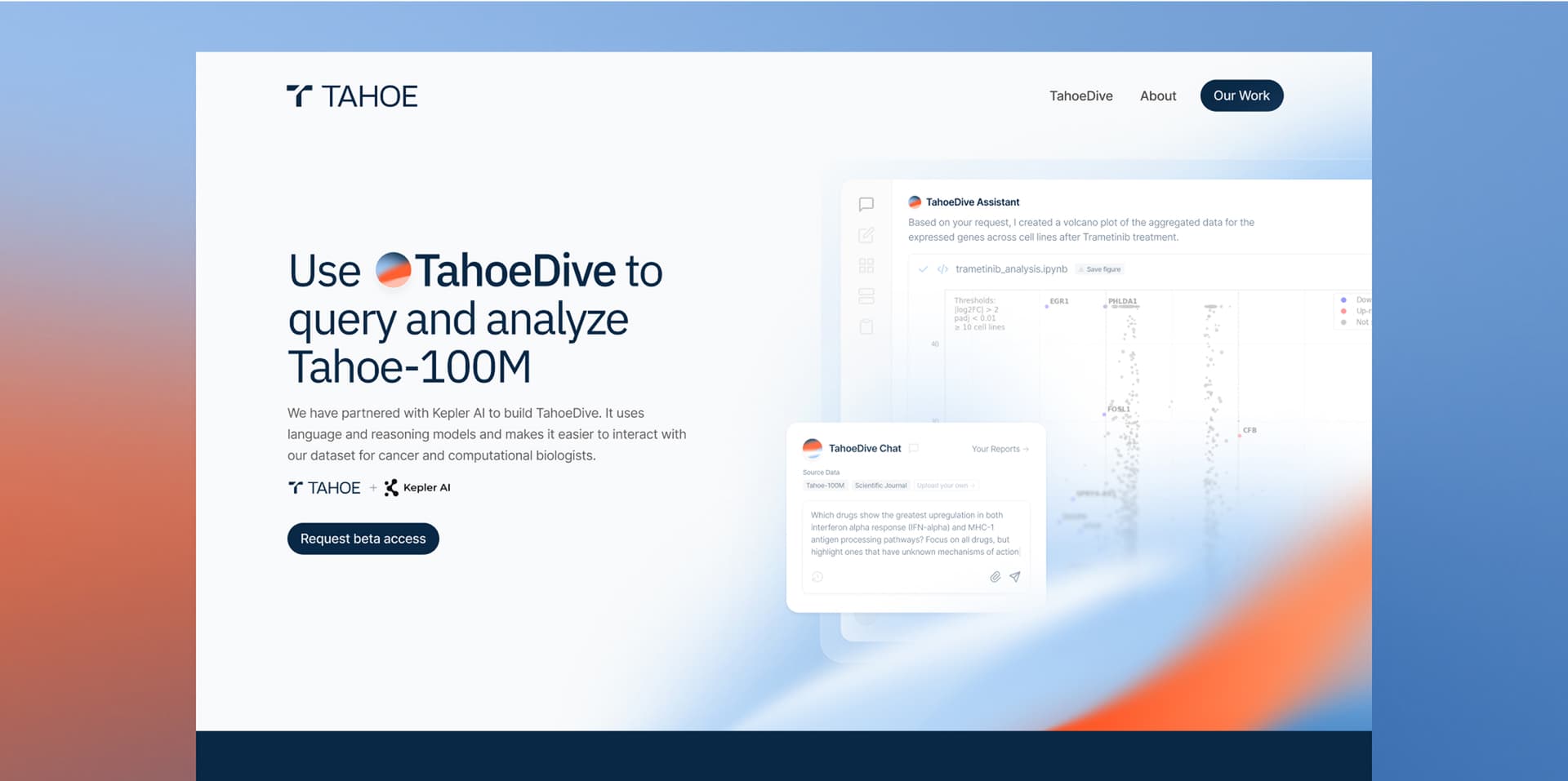
Helping Tahoe to look and feel like the trusted player they are in the biotech space
Tahoe engaged Oratory for a 4-week sprint covering logo through website refresh. The company began with a different name and concluded with an updated logo, color palette, and comprehensive brand system designed for future expansion, launching with a live website.
Industry
AI, Biotech, Software
Services
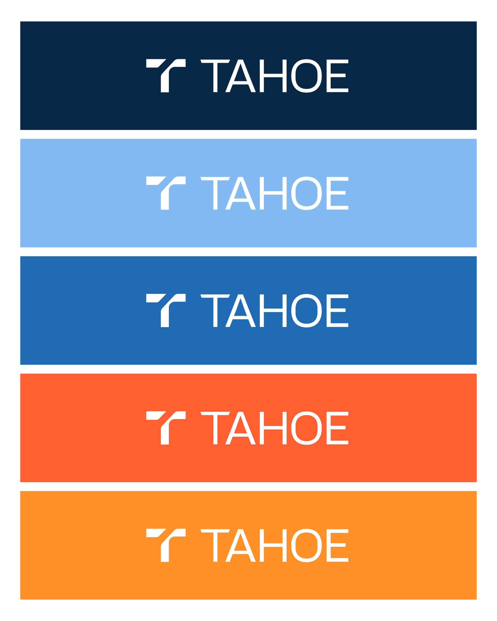
Brand Refresh, Logo Design, Web Design, Webflow Dev
Live Site
tahoebio.ai ↗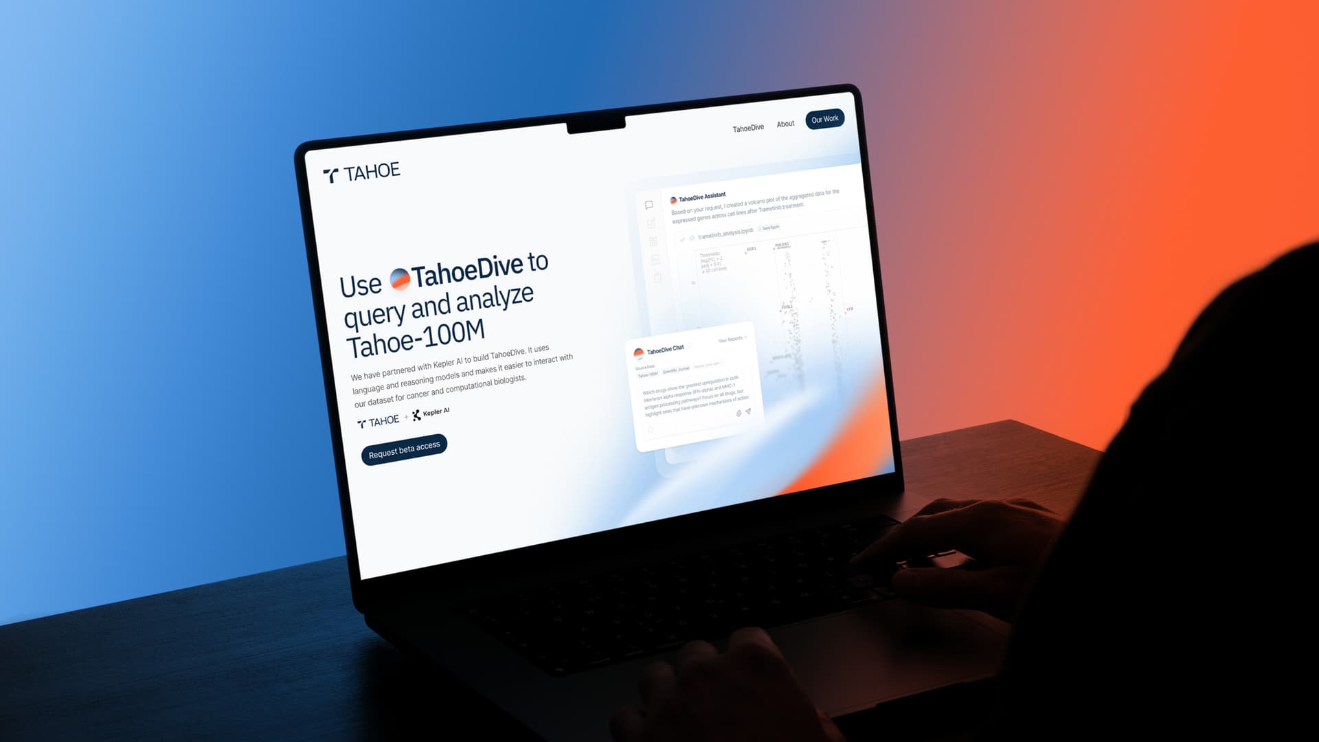
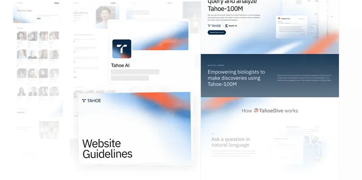
Logo Design
Multiple options were presented; the T mark was selected as the primary logo, paired with new logotype to establish the foundation for subsequent brand work.
Digital-First Design
The brand prioritizes digital spaces, addressing the common need among tech startups to maintain consistency across websites, social media, and sales materials.
The Result
By project completion, Tahoe possessed resources for their next business phase. The partnership extended beyond the initial sprint to support a $30M fundraise and product announcements, expanding on established brand guidelines.
.jpg&w=1920&q=75)